In the era of constant change and technological advancement, it’s not uncommon for brands to undergo multiple rebranding exercises. However, what’s intriguing is the recent trend of some iconic brands reverting to their classic logos.
This “retro comeback” seems to be a strategic move aimed at capturing the attention of Gen Z. The young and tech-savvy generation, and strengthening brand loyalty among existing customers.
The Impact of Brand Identity
Brand Identity, often encompassing elements like logos, slogans, packaging, and brand names, serves as the face of a company, communicating its values and unique characteristics to consumers.
A strong and memorable Brand Identity can leave a lasting impression, enabling easy recognition and recall among customers, a vital aspect of successful marketing.
Take the example of Heinz, whose ketchup and logo are well-known worldwide. In a social experiment called “Heinz Draw Ketchup,” users from various countries were asked to sketch the simplest representation of a ketchup bottle.
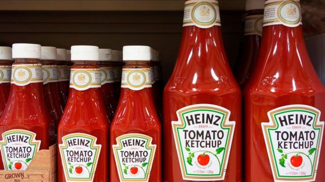
Despite individual variations in drawing quality, the overall result highlighted a remarkable consistency. Most users depicted a ketchup bottle resembling Heinz’s iconic product, some even including the “Heinz” brand name in their sketches. This experiment reinforced the enduring power of Brand Identity and its ability to evoke a sense of familiarity and trust among consumers.
Revisiting the Classics
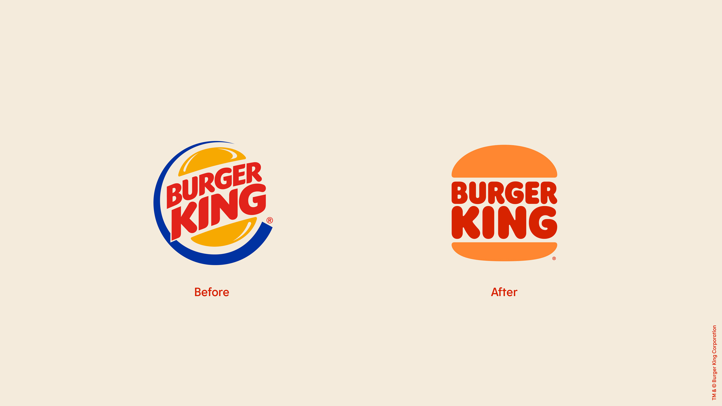
Brands like Burger King, Pepsi, and Burberry have also decided to revisit their past by embracing their classic logos. In 2021, Burger King unveiled its redesigned logo, inspired by its original emblem from 1969 to 1999. The new logo retains the essence of the classic design while infusing a fresh touch to appeal to modern sensibilities.
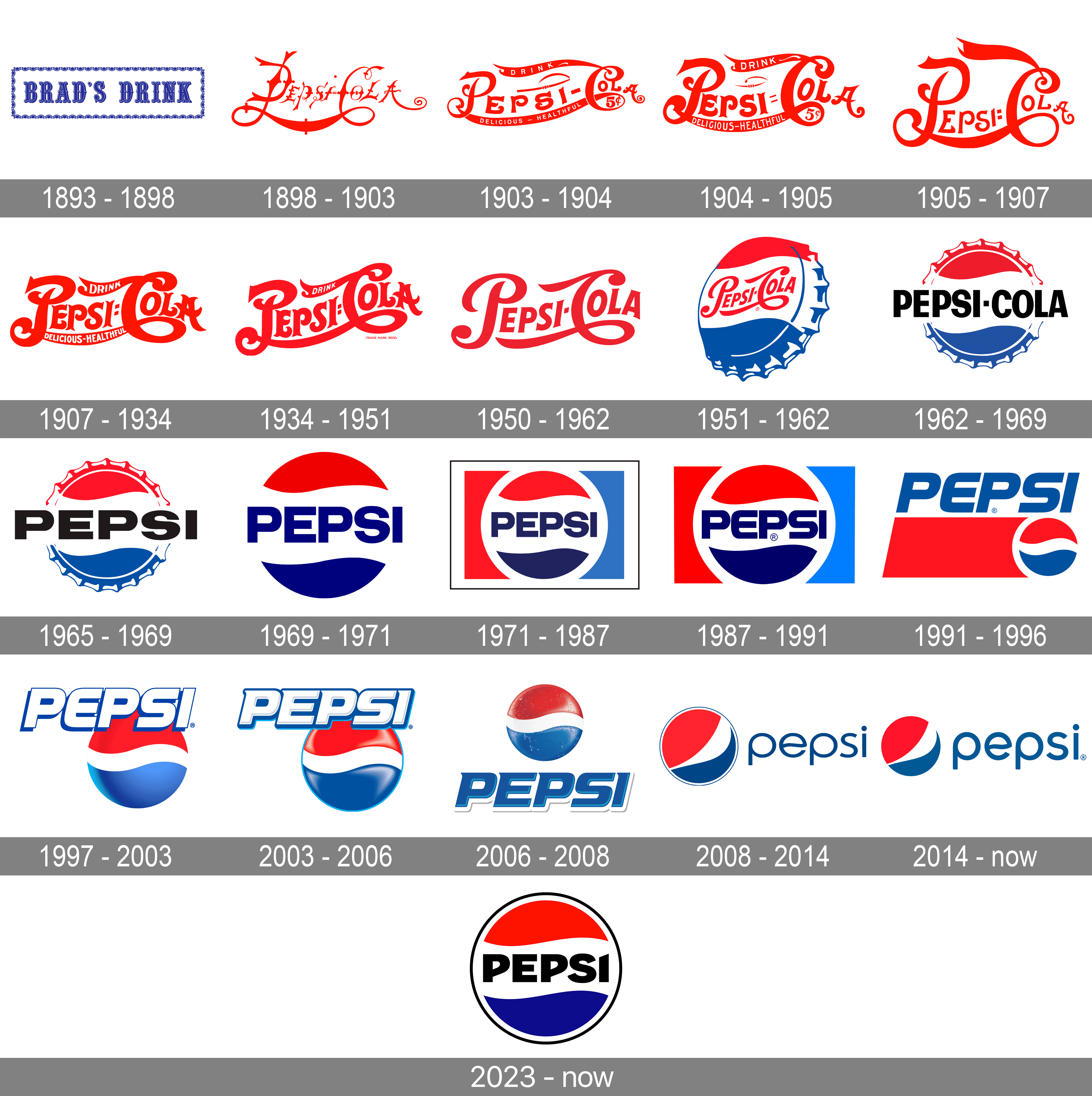
A similar strategy was employed by Pepsi when it introduced its latest logo, which shares similarities with the brand’s iconic emblem from 1987 to 1997 but incorporates modern elements like a Serif font and a tweaked circle shape.
Even fashion houses are not immune to this trend. Burberry, known for its elegant knight-on-horseback logo, made significant changes over the years. However, in a bold move in 2023, the brand reintroduced the knight and horse imagery, along with a Serif font in royal blue.
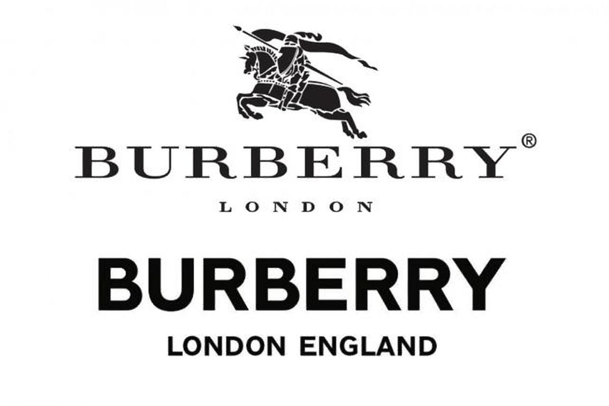
This return to its roots sparked excitement among consumers and reinforced the brand’s connection with its heritage.
When the brand “turns upstream” back to the past
The decision to revive classic logos is driven by several factors. For one, it allows brands to tap into nostalgia, a powerful emotion that evokes positive memories and associations with the past. In an age where the Gen Z demographic is yet to reach its full potential as consumers, leveraging nostalgia enables brands to connect with this audience on a deeper level.
By drawing from their heritage, brands can instill a sense of authenticity and timelessness that resonates with younger consumers seeking meaningful experiences.
Moreover, returning to classic logos can be a cost-effective strategy for brands. Instead of investing heavily in a complete rebranding. Brands can update their classic logos with subtle modifications, reducing expenses while still achieving a refreshed look.
Face with the Challenges
While the move towards classic logos is compelling, it comes with its challenges. Encouraging CEOs and brand managers to embrace the past requires a well-grounded marketing strategy and evidence-based reasoning. Demonstrating the psychological impact of nostalgia on consumers is essential to gain buy-in for such a shift.
Additionally, the increasing demand for vintage and classic products in the market has created scarcity, leading to higher prices for such items. This phenomenon highlights consumers’ inclination towards nostalgia and a desire for products that evoke a sense of timelessness.
The Minimalism Trend
In the realm of logo design, a growing trend is minimalism. As modern consumers are inundated with choices, brands are prioritizing simplicity to stand out in the clutter. Minimalist logos not only offer a clean and versatile visual identity but also align with the current cultural zeitgeist, where less is often considered more.
Moreover, more and more users are hunting for classic products, which are no longer widely available in the market. This has caused items to be pushed higher and higher prices based on the level of “unique” and age. Proving that users are always looking for the old, “classic” values. Recently, BlackPink member Jennie has been praised for wearing a series of classic Chanel items.

The online community believes that in order to pursue this hobby, the female singer has to spend a lot of money, and spend a lot of time and effort to “hunt” them. As soon as the image of her wearing Chanel’s old costumes made users excited, and at the same time proved herself worthy of being the face of the fashion house.
Fanta’s recent rebranding is a prime example of this approach. The brand simplified its logo, removing the iconic orange circle and leaf. And instead incorporated illustrations of the fruit flavor to enhance recognition.
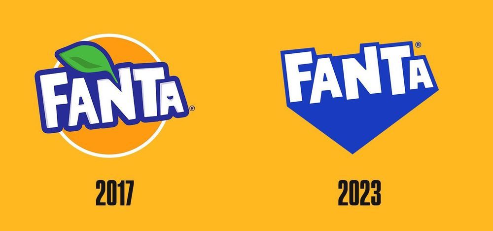
The new design was applauded for its practicality and ability to make the brand distinctive among competitors.
Conclusion
The return to classic logos by iconic brands reflects a strategic effort to tap into nostalgia, engage Gen Z consumers, and reinforce brand loyalty. By striking a balance between preserving their heritage and infusing modern elements. These brands are successfully navigating the dynamic landscape of branding and leaving a lasting impression on their audience.
As the world continues to evolve, embracing nostalgia seems to be a timeless approach to building a loyal and connected customer base.
